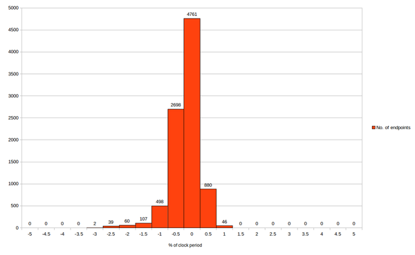
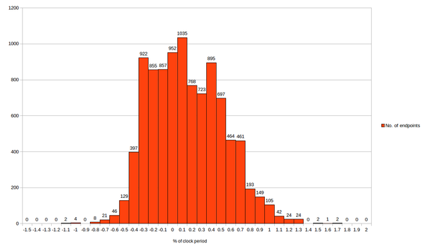
The first graph is for setup and second graph is for hold
From first graph, we can say, OpenSTA setup time correlates within -3% to +1% of clock period with “--------” STA tool. Which means maximum (setup) slack deviation between two tools is -300ps to 100ps
From second graph, we can say OpenSTA hold time correlates within -1.1% to 1.7% of clock period with “-------” STA tool. Which means minimum (hold) slack deviation between tools is -110ps to +170ps
NOTE – Generally for hold slack, the criteria is stricter compared to setup
Looks quite simply done (QSD)– Isn’t it?
No, it’s not. If it had been simple, anyone would had done this.
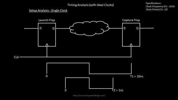
The big question is “WHY” do we even see -3% or +1% or -1.1% or +1.7%? That’s where analysis experts come into picture. Remember, from one of my STA – Part 1 or STA – Part 2 courses, that “slack” is made up of launch clock delay, capture clock delay, skew, data arrival time, library setup/hold time, CPPR, individual net and cell delay, clock uncertainty
Now build similar histograms for all the components of “slack”, then analyze, where is the deviation coming from, try modelling that deviation in OpenSTA tool and re-run the entire experiment again to identify, how much has it improved. That’s what will complete the benchmark for top 10k paths
Does this also look QSD (quite simply done)?
No, it’s not. The next level – how does OpenSTA behaves compared to “-------” when modelling OCV, AOCV, SOCV. Another level (or a check) is the netlist and extracted spefs should be from same extraction engine. Everything should be same, expect the timing tool. That would complete the benchmarking
Now, does it still look QSD (quite simply done)?
Wait – I haven’t even started talking about extraction correlation, DRC correlation, LVS correlation, SI correlation …. and I have a huge list which exactly tells you what it would take to qualify
Final note- All above graphs is from pre-layout netlist. What about correlation on post-layout netlist? Stay tuned for my upcoming blogs